2DArtist / Issue 026 / February 2008
Figurative & Foundational Studies Series 3





"Space is another important element that is directly related to how a viewer perceives depth."
Introduction
In last month's article, we took a look at what could be considered the most complex of all the seven elements of art: color. In this third and final installment, I'll be explaining the remaining elements of value, space and texture. I'll also be creating a figure study that incorporates all of these elements using a mixture of traditional and digital mediums.
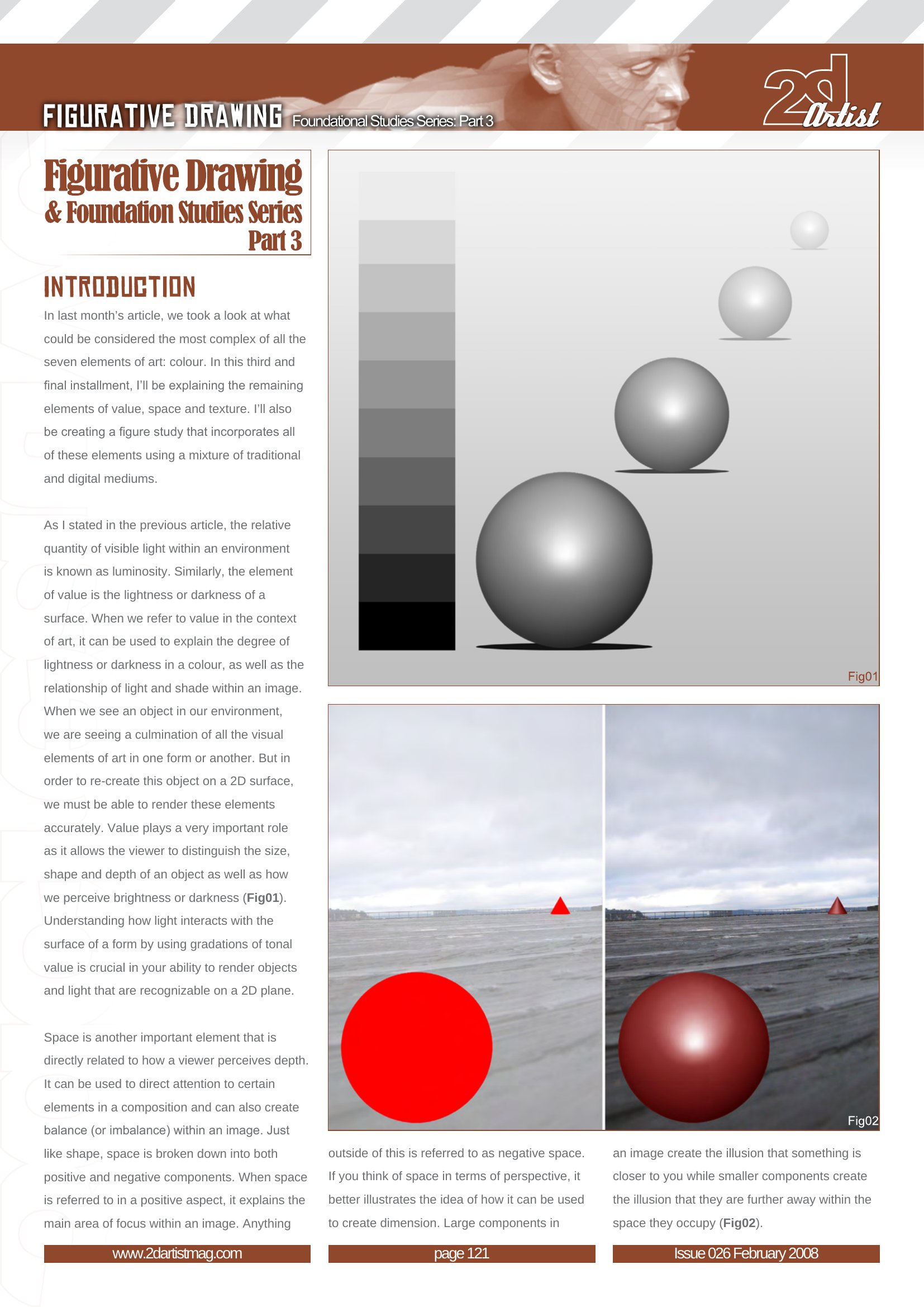
As I stated in the previous article, the relative quantity of visible light within an environment is known as luminosity. Similarly, the element of value is the lightness or darkness of a surface. When we refer to value in the context of art, it can be used to explain the degree of lightness or darkness in a color, as well as the relationship of light and shade within an image. When we see an object in our environment, we are seeing a culmination of all the visual elements of art in one form or another. But in order to re-create this object on a 2D surface, we must be able to render these elements accurately. Value plays a very important role as it allows the viewer to distinguish the size, shape and depth of an object as well as how we perceive brightness or darkness (Fig.1). Understanding how light interacts with the surface of a form by using gradations of tonal value is crucial in your ability to render objects and light that are recognizable on a 2D plane.
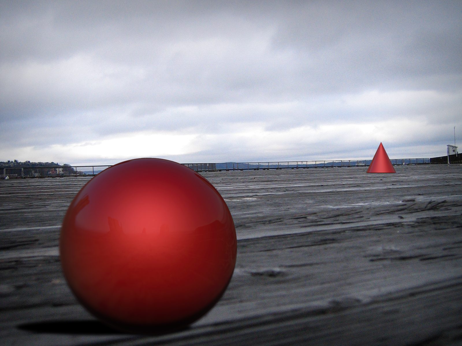
Space is another important element that is directly related to how a viewer perceives depth. It can be used to direct attention to certain elements in a composition and can also create balance (or imbalance) within an image. Just like shape, space is broken down into both positive and negative components. When space is referred to in a positive aspect, it explains the main area of focus within an image. Anything outside of this is referred to as negative space. If you think of space in terms of perspective, it better illustrates the idea of how it can be used to create dimension. Large components in an image create the illusion that something is closer to you while smaller components create the illusion that they are further away within the space they occupy (Fig.2).

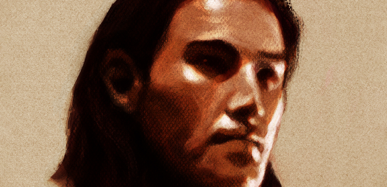
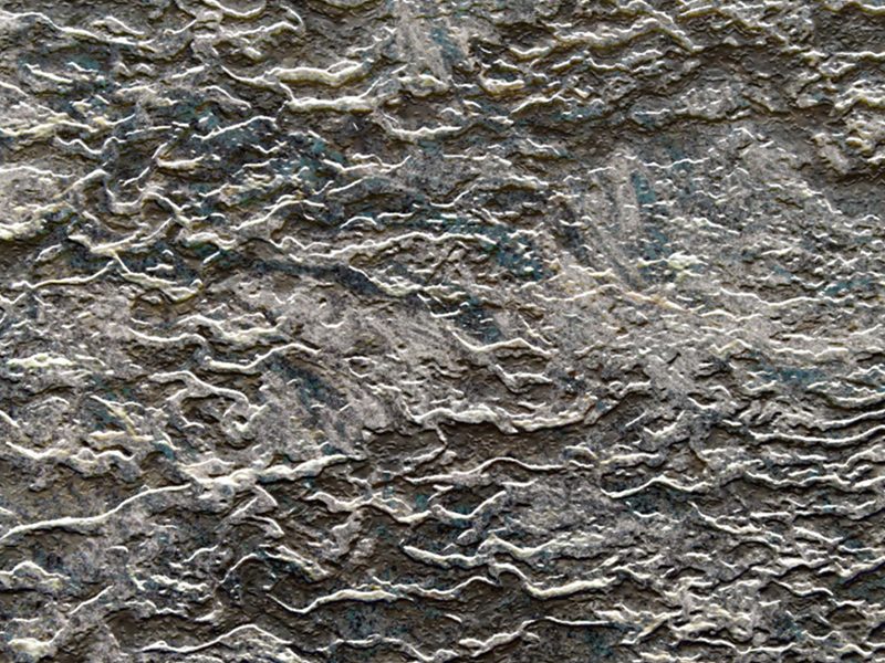
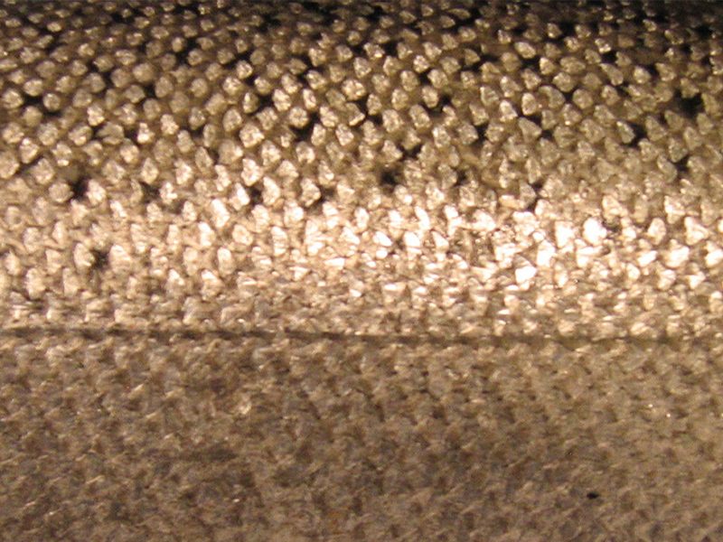
Our final element is texture, which refers to the surface quality of an image (Fig.3). It can be expressed in both a physical or visual sense and can be implied in a way where it is rendered with realism or abstractly. Outside of the 2D realm, texture can be a physical experience such as in sculpture or collage. Because everything around us contains its own texture, an artist looking to re-create what's in front of them must understand how surfaces interact with light to create the texture we see. Doing so, allows the artist to illustrate how a surface looks and feels such as it would in real life.


So now that we've concluded the explanation for all seven elements of art, I will demonstrate how you can apply them by creating a figure study that incorporates each one. I will be working from a reference photo (Fig.4), made available with permission by Hong Ly of characterdesigns.com. To render the image, I'll be using colored pencil on textured 9x12 neutrally colored pastel paper which I'll later bring in to Photoshop for additional editing. Let's begin!
 Fig.4
Fig.4
Because I am working from a reference image, I purposely choose a reference where miscellaneous objects are omitted from the background so that the central focus of the image is only the figure and nothing more. This allows me to better view the figure's musculature as it sits in space without distraction.
I begin by creating a loose gesture rough to gauge the figure's overall size and proportions (Fig.5). As I do this, I'm looking for a balance between the height and width of the figure as it relates to the dimensions of the area on the paper I'm working with. When I'm happy with the rough, I lightly fill in the negative space outside the gesture with dark color, carefully evaluating the spacing between the figure and the background. As I stated in the first part of the series, care must be taken when establishing shapes. Each shape must be created with accuracy because they in turn affect, and are affected by, the shapes they surround. If you establish a shape hastily, errors in proportion and alignment will occur.
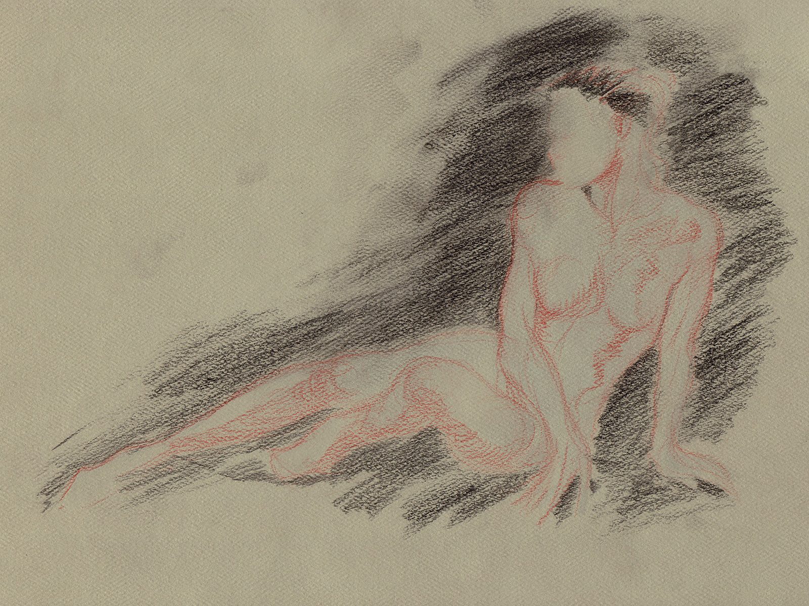 Fig.5
Fig.5
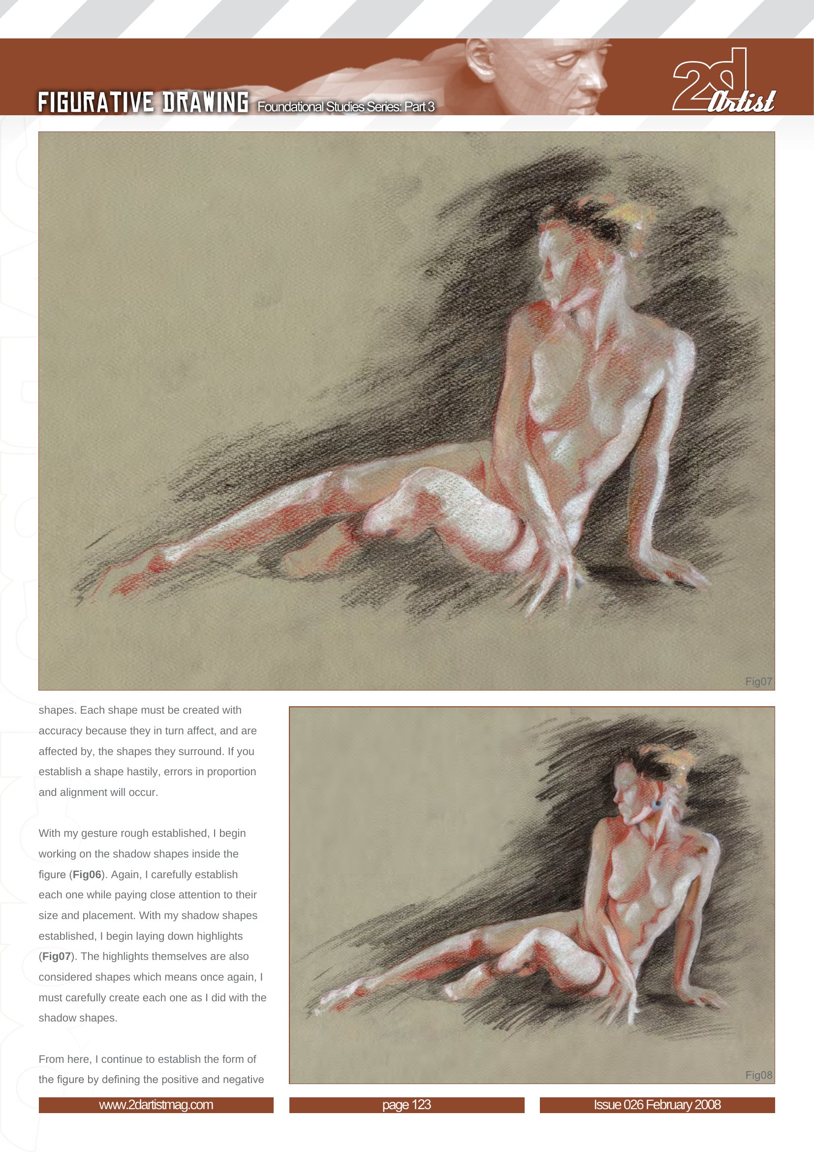
With my gesture rough established, I begin working on the shadow shapes inside the figure (Fig.6). Again, I carefully establish each one while paying close attention to their size and placement. With my shadow shapes established, I begin laying down highlights (Fig.7). The highlights themselves are also considered shapes which means once again, I must carefully create each one as I did with the shadow shapes.
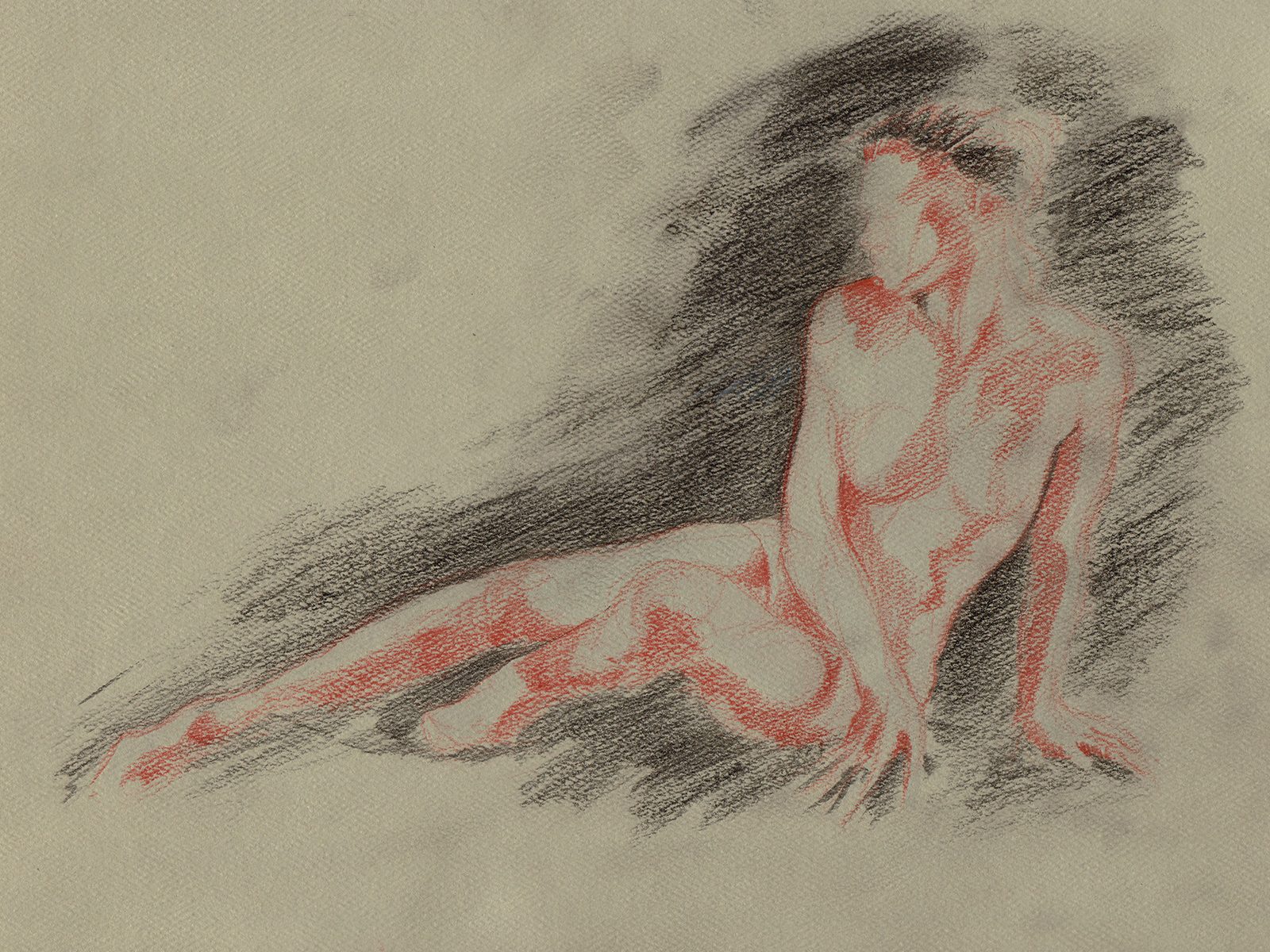 Fig.6
Fig.6
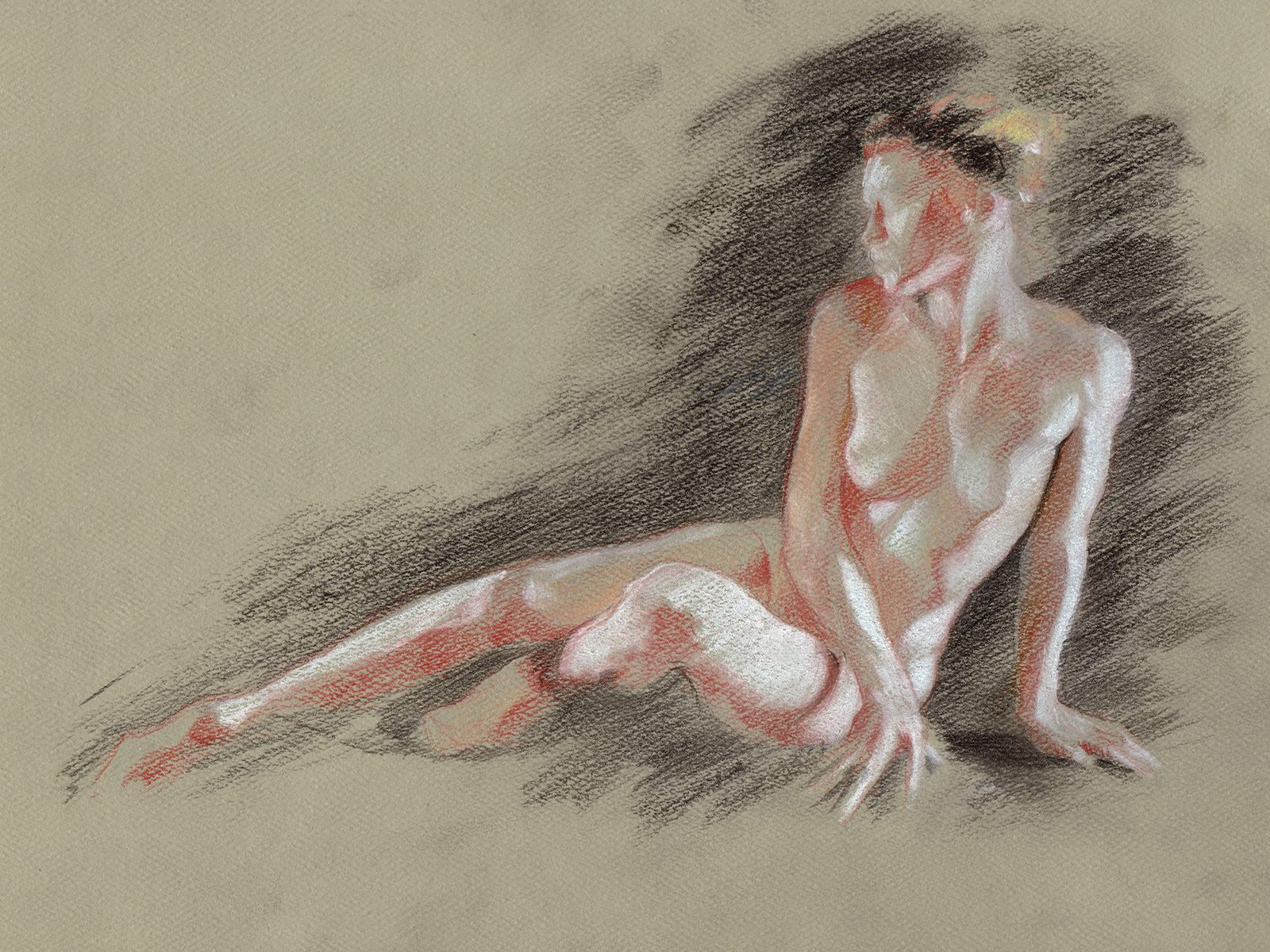 Fig.7
Fig.7
From here, I continue to establish the form of the figure by defining the positive and negative shapes through tonal value (Fig.8). I create hard edges along these shadow shapes through the use of tone instead of direct lines inside the figure. While it may seem that lines have been drawn, if you look closely, they are actually edges where shadow and light meet (Fig.9).
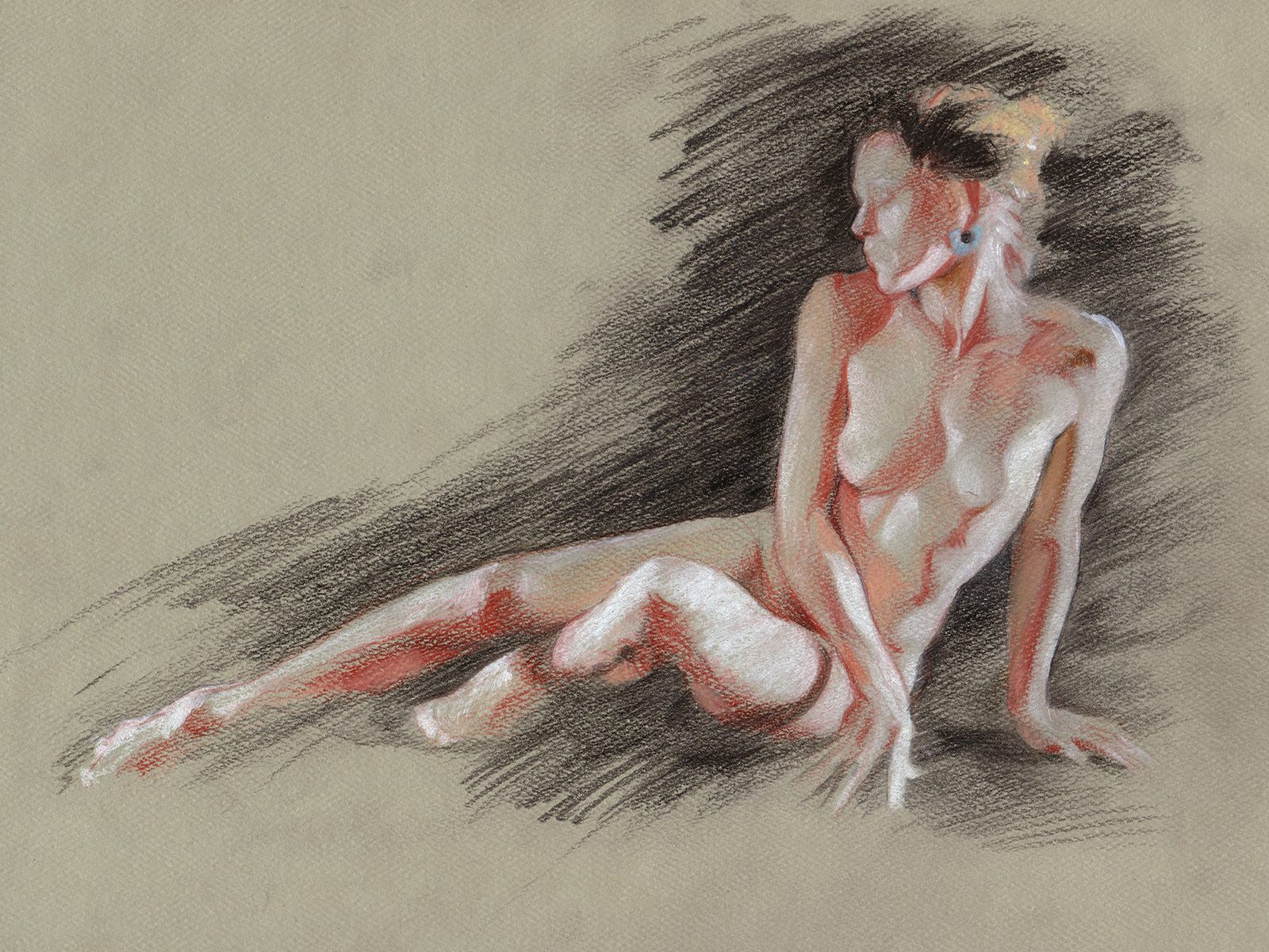 Fig.8
Fig.8
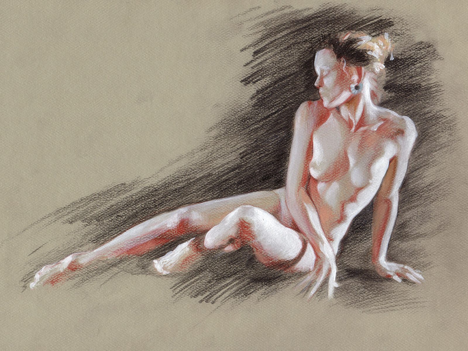 Fig.9
Fig.9
At this point, I take a step back and review the work that I've done. Already I notice that alignment and proportional issues have occurred. Most of these issues can be fixed, however, a little surgery will need to take place. I use small amounts of white acrylic which I lay down using a brush to push and adjust the highlight shapes, while continuing to use the colored pencils to adjust my shadow shapes until their size and alignment are correct (Fig.10).
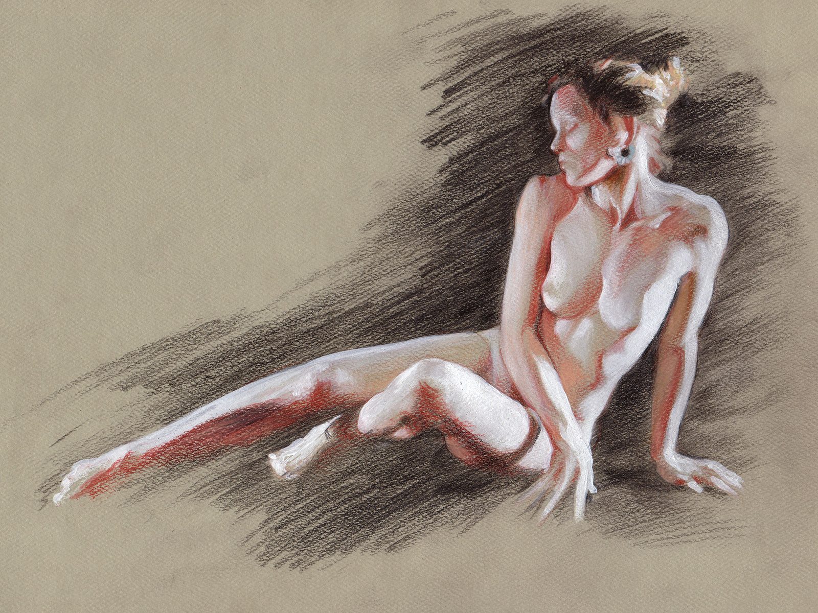 Fig.10
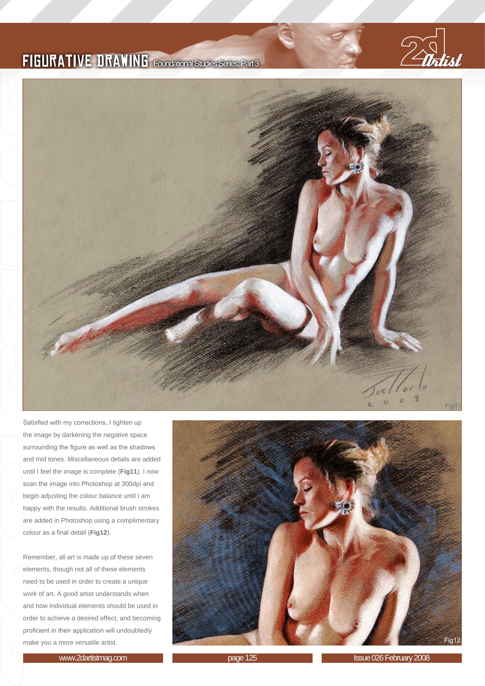
Satisfied with my corrections, I tighten up the image by darkening the negative space surrounding the figure as well as the shadows and mid tones. Miscellaneous details are added until I feel the image is complete (Fig.11). I now scan the image into Photoshop at 300dpi and begin adjusting the color balance until I am happy with the results. Additional brush strokes are added in Photoshop using a complimentary color as a final detail (Fig.12).
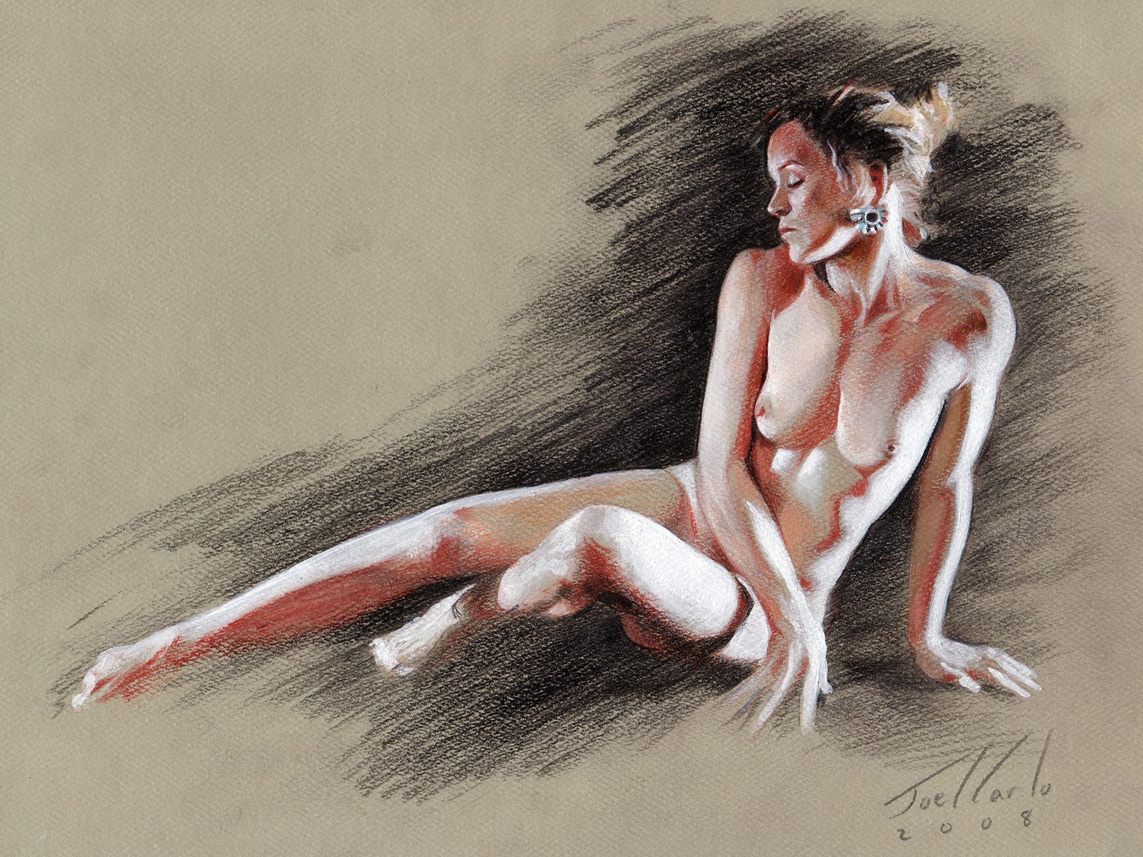 Fig.11
 Fig.12
Remember, all art is made up of these seven elements, though not all of these elements need to be used in order to create a unique work of art. A good artist understands when and how individual elements should be used in order to achieve a desired effect, and becoming proficient in their application will undoubtedly make you a more versatile artist.
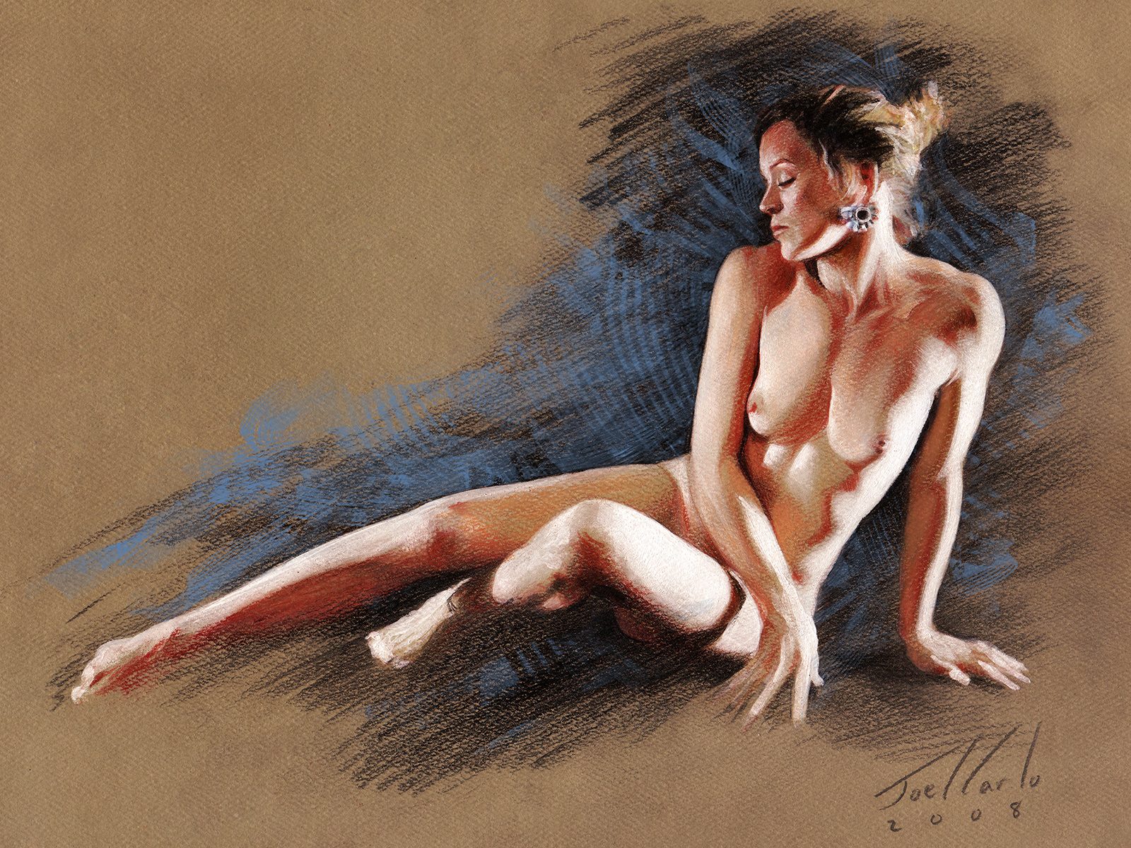 Final
Final