
2DArtist / Issue 025 / January 2008
Figurative & Foundational Studies Series 2

"Speaking of light, color is exactly that: light! When you see a color, you are essentially seeing reflected light..."
Introduction
In last month's article (Issue 024) we took a look at three of the seven essential elements of art. Moving right along, we continue with the second installment of this three-part series by expanding into what could be considered the most complex of all the seven elements: color.
Color is of, and in itself, an immense topic and one that can hardly be covered over the scope of this article. However, my aim is to explain the fundamental basics of color to you in the hopes that you leave with a better understanding of how color can be used to accentuate what you may (or may not) already know. For the lucky few who have a seemingly innate understanding of the subject, this article will probably seem a bit simple in its presentation, but for those who struggle with color and its application I believe it will help to shed some light on the matter.
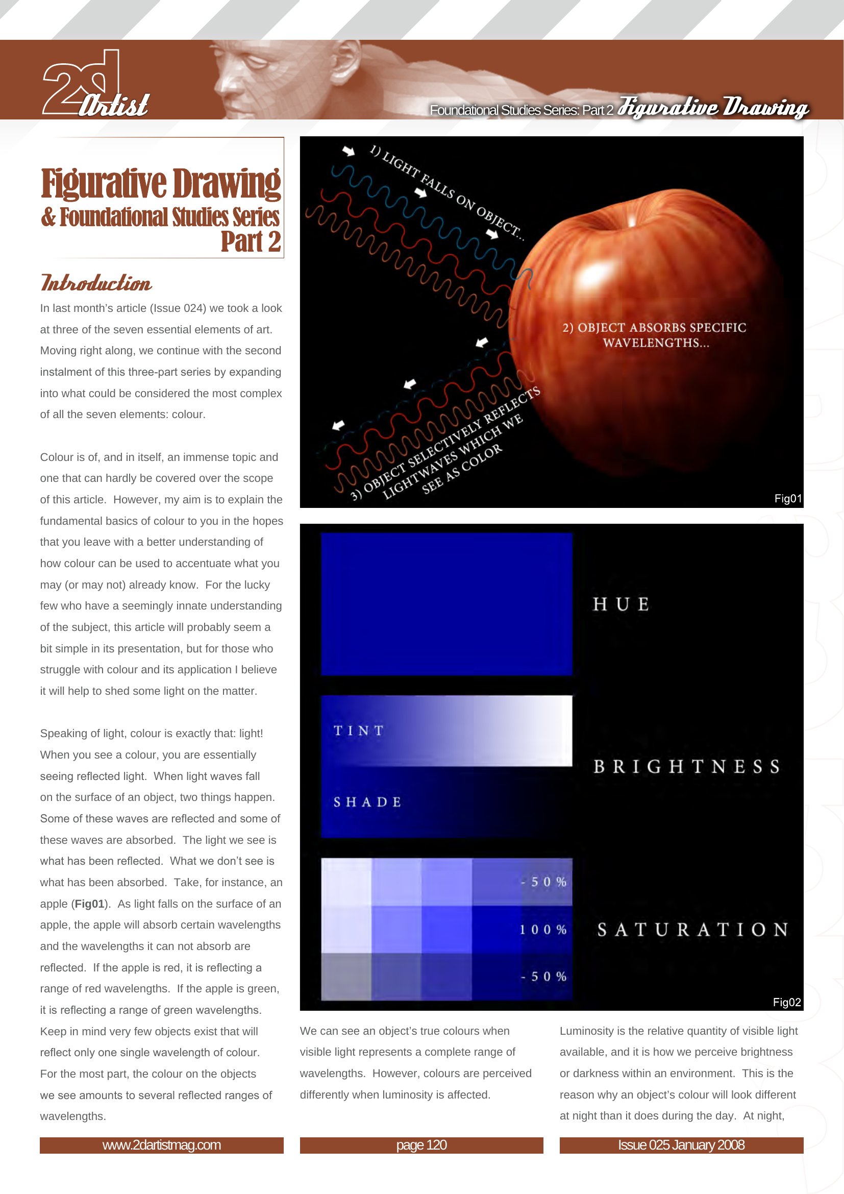
Speaking of light, color is exactly that: light! When you see a color, you are essentially seeing reflected light. When light waves fall on the surface of an object, two things happen. Some of these waves are reflected and some of these waves are absorbed. The light we see is what has been reflected. What we don't see is what has been absorbed. Take, for instance, an apple (Fig.1). As light falls on the surface of an apple, the apple will absorb certain wavelengths and the wavelengths it can not absorb are reflected. If the apple is red, it is reflecting a range of red wavelengths. If the apple is green, it is reflecting a range of green wavelengths. Keep in mind very few objects exist that will reflect only one single wavelength of color. For the most part, the color on the objects we see amounts to several reflected ranges of wavelengths.
- Light falls on the object
- The object's surface absorbs some wavelengths of light
- Other wavelengths are reflected toward our eyes
- Our eyes and brain interpret those reflected wavelengths as color
We can see an object's true colors when visible light represents a complete range of wavelengths. However, colors are perceived differently when luminosity is affected.
Luminosity is the relative quantity of visible light available, and it is how we perceive brightness or darkness within an environment. This is the reason why an object's color will look different at night than it does during the day. At night, there are less wavelengths of light available than there are during the day, and an object can only reflect wavelengths that are available within its environment. Think of a forest, for example. During the day, when light from the sun is abundant, we can clearly see a wide spectrum of colors within the forest. At night, when the forest is dimly illuminated by the moon's light, the colors you saw during the day will appear very different. The forest is reflecting a small range of wavelengths because of the scarcity of light surrounding it.
So now that we have an understanding of how and why we see color, let's take a look at some color basics...
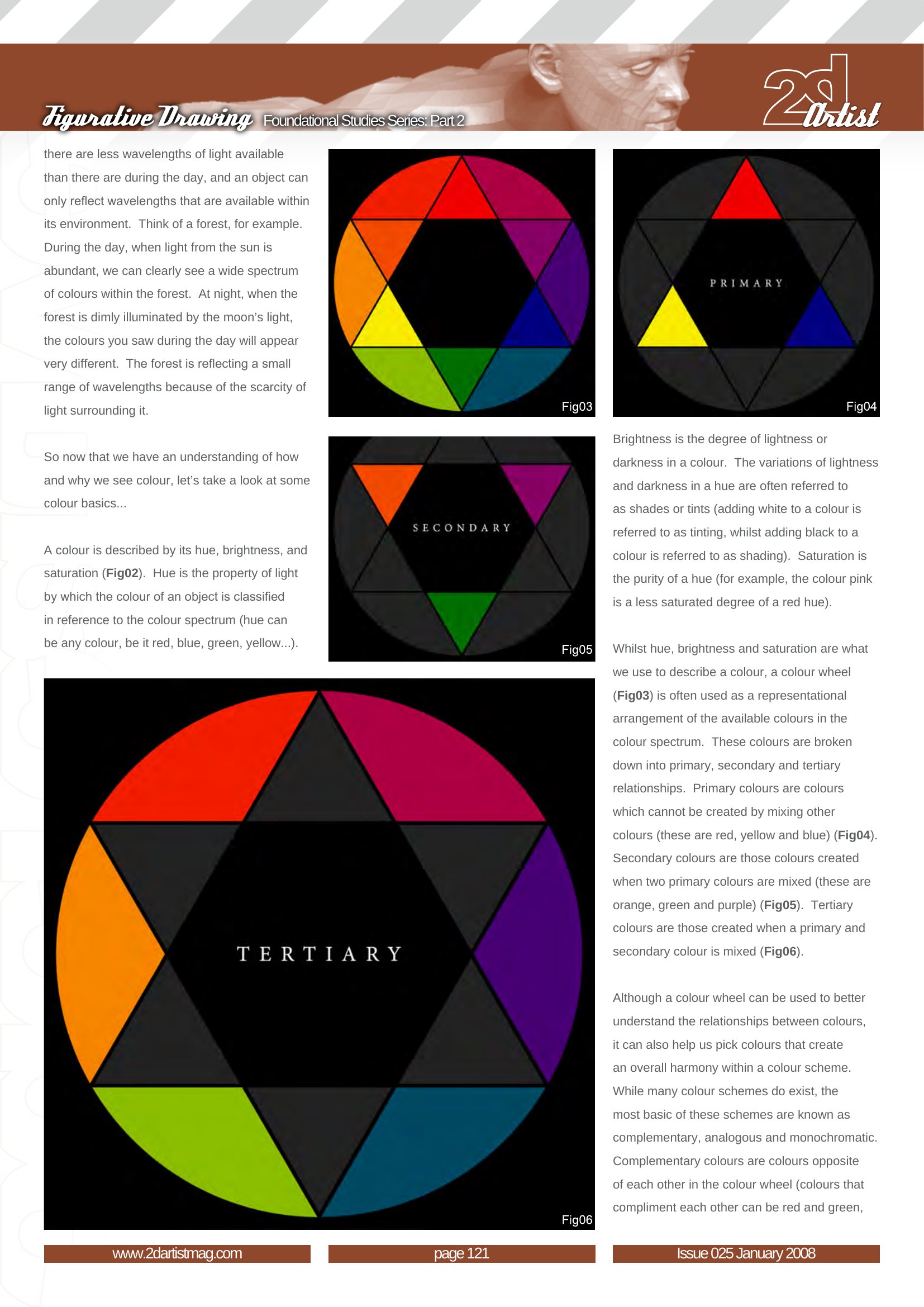
A color is described by its hue, brightness, and saturation (Fig.2). Hue is the property of light by which the color of an object is classified in reference to the color spectrum (hue can be any color, be it red, blue, green, yellow...). Brightness is the degree of lightness or darkness in a color. The variations of lightness and darkness in a hue are often referred to as tints, tones or shades (adding white to a color is referred to as tinting, adding gray is referred to as toning, while adding black to a color is referred to as shading). Saturation is the purity of a hue (for example, the color pink is a less saturated degree of a red hue).
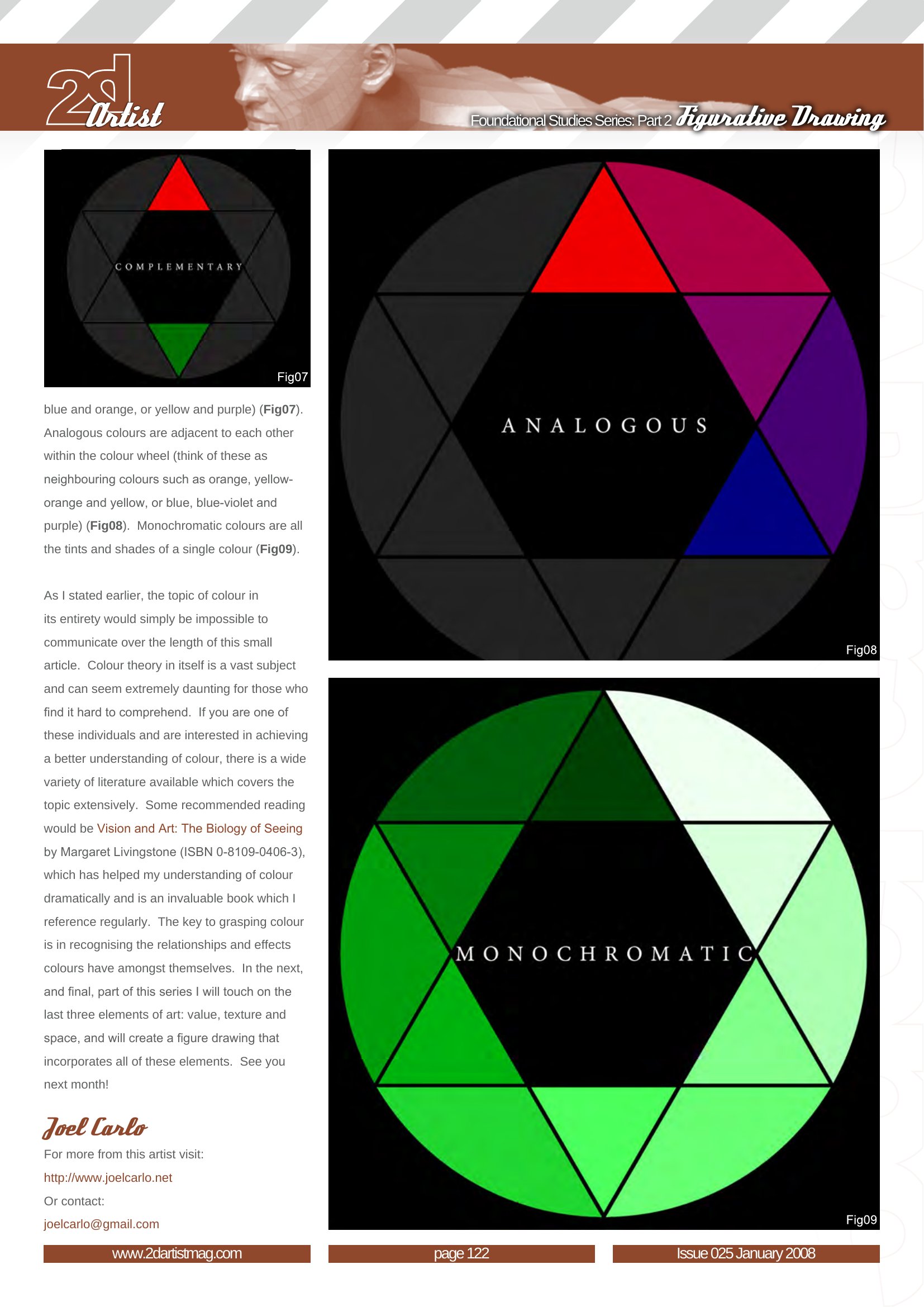
While hue, brightness and saturation are what we use to describe a color, a color wheel (Fig.3) is often used as a representational arrangement of the available colors in the color spectrum. These colors are broken down into primary, secondary and tertiary relationships. Primary colors are colors which cannot be created by mixing other colors (these are red, yellow and blue). Secondary colors are those colors created when two primary colors are mixed (these are orange, green and purple). Tertiary colors are those created when a primary and secondary color is mixed.
Although a color wheel can be used to better understand the relationships between colors, it can also help us pick colors that create an overall harmony within a color scheme. While many color schemes do exist, the most basic of these schemes are known as complementary, analogous and monochromatic. Complementary colors are colors opposite of each other in the color wheel (colors that compliment each other can be red and green, blue and orange, or yellow and purple). Analogous colors are adjacent to each other within the color wheel (think of these as neighboring colors such as orange, yellow-orange and yellow, or blue, blue-violet and purple). Monochromatic colors are all the tints and shades of a single color.
As I stated earlier, the topic of color in its entirety would simply be impossible to communicate over the length of this small article. Color theory in itself is a vast subject and can seem extremely daunting for those who find it hard to comprehend. If you are one of these individuals and are interested in achieving a better understanding of color, there is a wide variety of literature available which covers the topic extensively. I recommend reading Vision and Art: The Biology of Seeing by Margaret Livingstone, which has helped my understanding of color dramatically and is an invaluable book which I reference regularly. The key to grasping color is in recognizing the relationships and effects colors have among themselves. In the next, and final, part of this series I will touch on the last three elements of art: value, texture and space, and will create a figure drawing that incorporates all of these elements. See you next month!