ImagineFX / September 2006
Artist Insight Series: Figure Drawing

Introduction
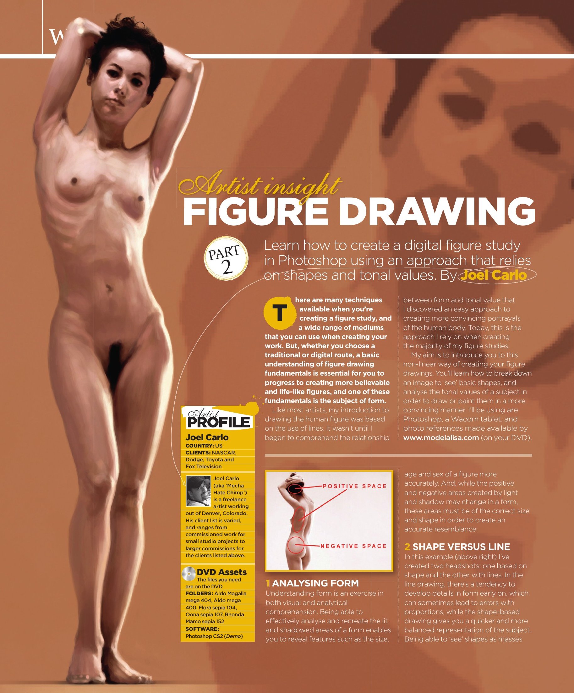
There are many techniques available to use when creating a figure study. Equally, a wide range of mediums also exist that can be used when creating your work. Whether you choose a traditional or digital route, a basic understanding of figure drawing fundamentals is essential to facilitate the progress of creating more believable and life-like figures. One of these key fundamental elements is the subject of form.
Like most artists, my introduction to drawing the human figure was based on the use of lines. But it wasn't until I began to comprehend the relationship between form and value that I realized an easy approach to creating more convincing portrayals of the human body. Today, this is the approach I rely on most when creating the majority of my figure studies.
For those not familiar with this technique, my aim in this article is to introduce you to it as a non-linear way of creating your figure drawings. Its purpose is to help you break down an image to "see" basic shapes and analyze values of a subject in order to draw or paint them in a more convincing and efficient manner. The tools I will be using are Photoshop, a Wacom tablet, and photo references made available by modelalisa.com.
1. Analyzing Form
Understanding form is an exercise in both visual and analytical comprehension. Being able to effectively analyze and recreate the lit and shadowed areas of a form allows you to reveal features such as the size, age and sex of a figure more accurately. And while the positive and negative areas created by light and shadow may change on a form, these areas must be of the correct size and "shape" in order to create an accurate resemblance.
2. Shape Versus Line
In this example, I have created two headshots; one based on shape and the other with line. In the line drawing, there is a tendency to develop details in form early on which can sometimes lead to errors with proportions, while the shape developed drawing gives you a quicker and more balanced representation of the subject. Being able to "see" shapes as relative masses to one another allows you to better gauge your form and proportions while lessening the chance of developing your image incorrectly.
3. Breaking It Down
Being able to recognize and distinguish shapes in value can at first seem tricky, but as you continue to do so it will become more intuitive. Remember that in value there are shapes within shapes, and these shapes in turn create even more shapes. If it seems a bit daunting, try to think of it as one big jigsaw puzzle. The key point is to start by recognizing and developing the largest shapes first, mid sized shapes next, and smallest shapes last.
4. Choosing A Reference
I begin by bringing up several of the figure reference movies made available on the dvd and browse through each model. What I'm looking for is a shot of a pose with good lighting that compliments the model's figure and features. Once I have decided on a pose, I enlarge the movie to screen resolution and take a screen shot to bring into Photoshop.
5. Preparing The Work Area
Once in Photoshop, I crop the model and make a slight adjustment to my levels in order to give the image a bit more contrast. This will allow me to see the light and shadow placements easier and prepare the image for the next step. I duplicate the layer and choose the Cutout filter under Filter > Artistic > Cutout.
6. The Cutout Filter
The Cutout filter is a great tool that can break down an image into simple shapes of tone. It can be used to help you "see" larger tonal masses and their placement within an image while indirectly creating a simplified color palette for you to use. With this photo reference, a level adjustment setting of "5" gives me a good balance of large to mid size tonal shapes.
7. The Silhouette
Once I have applied the filter changes to my duplicate layer, I create a new work area and choose a background color that is of mid value range and that will compliment my color palette. I create a new layer and using color from the filtered reference, I begin to draw out a rough silhouette using a standard rounded brush with a smooth opacity fade. I keep my work area close to the reference image in order to better gauge my silhouette's shape and alignment.
8. Evaluating Tone Placement
With my silhouette complete, I now begin to evaluate the placement of all the tonal areas in my reference image beginning with the largest ones first. Once I am comfortable with seeing their placement in the image, I create another layer and begin to draw them over the silhouette.
9. Laying Down Shapes
Drawing each shape is done in a hierarchal manner by establishing the largest areas first, then working my way down to the mid sized shapes next, and smallest shapes last. I carefully draw each area incrementally using new layers and only move to the next when I feel the previous areas have been established correctly.
10. Proportion And Alignment
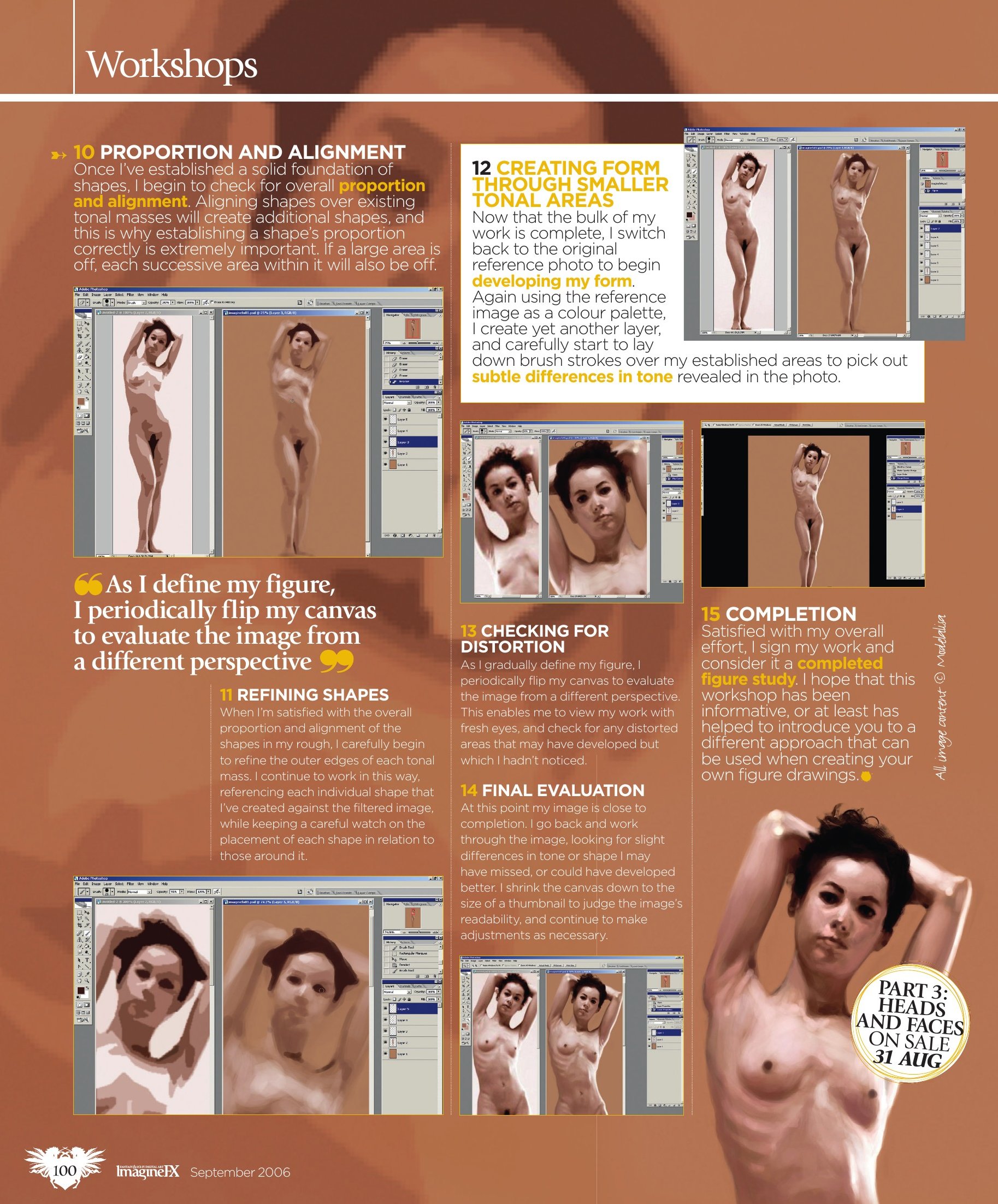
Once I have a solid foundation of shapes established, I begin to check for overall shape proportion and alignment. Aligning shapes over existing tonal masses will create additional shapes. This is why establishing a shape's proportion correctly is extremely important. If a large area is off, each successive area within it will also be off.
11. Refining Shapes
When I am satisfied with the overall proportion and alignment of the shapes in my rough, I carefully begin to refine the outer edges of each tonal mass. I continually work in this way, referencing each individual part I've created to that of the cutout reference while keeping a careful watch of the placement of each part in relationship to one another.
12. Creating Form Through Smaller Tones
Now that the bulk of my work is complete, I switch back to the original photo reference to begin developing my form. Still using the photo reference as a direct color palette, I create yet another layer and slowly lay down brush strokes over my established areas, using careful observation to pick out subtle differences in tone revealed through the photo reference.
13. Checking For Distortion
As I gradually define my figure, I periodically flip my canvas to evaluate the image from a different perspective. This allows me to view my work with fresh eyes and check for any distorted areas that may have developed but were not previously noticed.
14. Final Evaluation
At this point my image is close to completion. I will go back and work through the image, looking for slight differences in tone or shape I may have missed or could have developed better. I shrink the canvas down to the size of a thumbnail to judge the image's readability and continue to make adjustments as I see fit.
15. Completion
Satisfied with my overall effort, I will sign my work and consider it a completed figure study. I hope that this tutorial has been informative or at the very least helped introduce you to a different approach that can be used when creating your own figure drawings.